Plot hematopoiesis intensity, blood lineage
usage: plot_blood_lineage.py [-h] -f INPUT [--min MIN]
                             [--custom_color_scale CUSTOM_COLOR_SCALE]
                             [--svg_template SVG_TEMPLATE] [-o OUTPUT]

optional arguments:
  -h, --help            show this help message and exit
  -f INPUT, --input INPUT
                        2 column tsv, no header, the values for each cell type
                        (default: None)
  --min MIN             set min value, otherwise infered from data (default:
                        None)
  --custom_color_scale CUSTOM_COLOR_SCALE
                        You can define your own color scheme (linear from
                        lowest to highest) using hex color, separated by comma
                        (default: #ffffff,#ff8000,#660000)
  --svg_template SVG_TEMPLATE
  -o OUTPUT, --output OUTPUT
                        output file name (default:
                        yli11_2020-01-17_929f6724faa3)
Summary
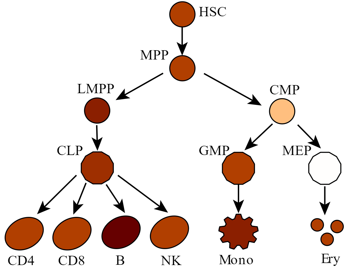
Plot a value intensity colored hematopoiesis figure.
Input
A 2-col tsv file where you only need to modify the second column with your own value.
There are 13 cell types in this figure, you have to give values for all of them. The first column is the keyword.
HSC     4
MPP     4
LMPP    5
CLP     4.5
GMP     4
MEP     -2
CMP     0
CD4     4
CD8     4
B       6
NK      4
Mono    5
Ery     4
Usage
hpcf_interactive

module load python/2.7.13

plot_blood_lineage.py -f input.tsv -o myPlot
Example
hpcf_interactive

module load python/2.7.13

## for hg19 data visualization
plot_blood_lineage.py --svg_template /home/yli11/HemTools/share/misc/blood_lineage_Hchang_13cells.svg -f /home/yli11/HemTools/share/misc/values.tsv

## for mm9 data visualization
plot_blood_lineage.py --svg_template /home/yli11/HemTools/share/misc/mouse_blood.svg -f peak_overlap_percent.tsv
SVG to PDF
Some SVG files will lose the color info when importing to AI. So you can convert them to PDF files first. See code below:
hpcf_interactive

module load conda3

source activate /home/yli11/.conda/envs/pandoc

rsvg-convert -f pdf -o output_plot.pdf input.svg
Replace input.svg with the actual SVG file name.
Output
A SVG figure and a colorbar pdf. They will be emailed to you as well.