adding custom p-value bar to your ggplot
tested several R libraries, ggsignif is the best The following R libraries/functions doesn’t work
ggpubr/stat_pvalue_manual there’s some problems mapping xtick labels
ggpval only able to add one comparison p-value ref:https://cran.r-project.org/web/packages/ggpval/vignettes/ggpval.html
[20]:
library(ggplot2)
library(ggsignif)
#https://cran.r-project.org/web/packages/ggsignif/vignettes/intro.html
[21]:
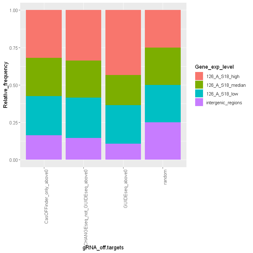
df = read.table("normalized.for_ggplot_S18.tsv",header=T)
levels(df$Gene_exp_level) = c('126_A_S18_high','126_A_S18_median','126_A_S18_low','intergenic_regions')
a=ggplot(df, aes(fill=Gene_exp_level, y=Relative_frequency, x=gRNA_off.targets)) +
    geom_bar( stat="identity", position="fill")+
    theme(axis.text.x = element_text(angle = 90, hjust = 1))
[22]:
a
[23]:
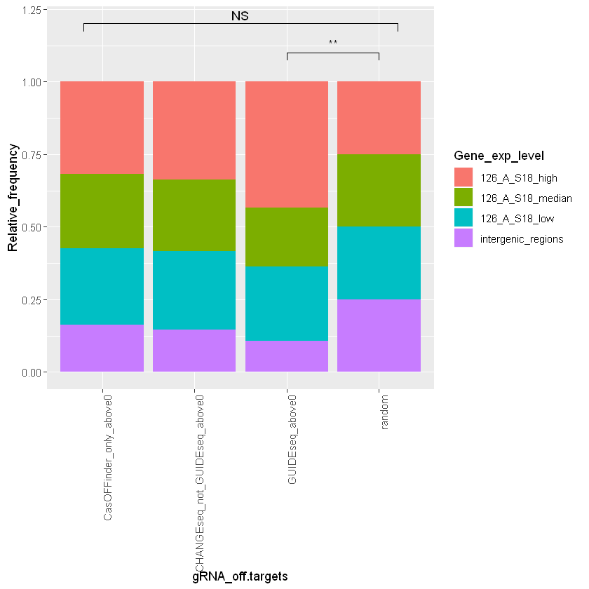
a+geom_signif(y_position=c(1.1,1.1), xmin=c("GUIDEseq_above0", 1.8), xmax=c("random", 2.2),annotation=c("**", "NS"), tip_length=0.001)+
geom_signif(y_position=c(1.2), xmin=c(0.8), xmax=c(4.2),annotation=c("NS"), tip_length=0.001)
Warning message:
"Removed 3 rows containing missing values (geom_signif)."
[ ]: