Python Heatmap plots
import these libraries, always the same, just copy and paste
[1]:
import pandas as pd
import seaborn as sns
import numpy as np
import matplotlib.pylab as plt
Open .tab files
[2]:
!head *tab
==> plotCorrelation_pearson.tab <==
#plotCorrelation --outFileCorMatrix
        'CaptureC_VHL_HBBP1_r2_S34'     'CaptureC_VHL_HBBP1_r1_S33'     'CaptureC_NT_HBBP1_r2_S32'      'CaptureC_NT_HBBP1_r1_S31'      'CaptureC_NT_BGLT3_r1_S27'      'CaptureC_NT_BGLT3_r2_S28'      'CaptureC_VHL_BGLT3_r2_S30'     'CaptureC_VHL_BGLT3_r1_S29'
'CaptureC_VHL_HBBP1_r2_S34'     1.0000  0.8264  0.7941  0.7769  0.7759  0.7847  0.8360  0.8478
'CaptureC_VHL_HBBP1_r1_S33'     0.8264  1.0000  0.8393  0.8501  0.8183  0.8106  0.8189  0.8571
'CaptureC_NT_HBBP1_r2_S32'      0.7941  0.8393  1.0000  0.9238  0.9150  0.9377  0.8321  0.8783
'CaptureC_NT_HBBP1_r1_S31'      0.7769  0.8501  0.9238  1.0000  0.9335  0.9366  0.8350  0.8764
'CaptureC_NT_BGLT3_r1_S27'      0.7759  0.8183  0.9150  0.9335  1.0000  0.9593  0.8673  0.8985
'CaptureC_NT_BGLT3_r2_S28'      0.7847  0.8106  0.9377  0.9366  0.9593  1.0000  0.8685  0.8916
'CaptureC_VHL_BGLT3_r2_S30'     0.8360  0.8189  0.8321  0.8350  0.8673  0.8685  1.0000  0.8942
'CaptureC_VHL_BGLT3_r1_S29'     0.8478  0.8571  0.8783  0.8764  0.8985  0.8916  0.8942  1.0000

==> plotCorrelation_spearman.tab <==
#plotCorrelation --outFileCorMatrix
        'CaptureC_NT_HBBP1_r2_S32'      'CaptureC_NT_HBBP1_r1_S31'      'CaptureC_VHL_HBBP1_r2_S34'     'CaptureC_VHL_BGLT3_r1_S29'     'CaptureC_VHL_HBBP1_r1_S33'     'CaptureC_NT_BGLT3_r1_S27'      'CaptureC_VHL_BGLT3_r2_S30'     'CaptureC_NT_BGLT3_r2_S28'
'CaptureC_NT_HBBP1_r2_S32'      1.0000  0.7023  0.6573  0.7158  0.7039  0.7341  0.6973  0.7267
'CaptureC_NT_HBBP1_r1_S31'      0.7023  1.0000  0.7154  0.7477  0.7076  0.7589  0.7547  0.7621
'CaptureC_VHL_HBBP1_r2_S34'     0.6573  0.7154  1.0000  0.7511  0.7305  0.7318  0.7876  0.7482
'CaptureC_VHL_BGLT3_r1_S29'     0.7158  0.7477  0.7511  1.0000  0.8114  0.7759  0.7967  0.7879
'CaptureC_VHL_HBBP1_r1_S33'     0.7039  0.7076  0.7305  0.8114  1.0000  0.7544  0.7826  0.7614
'CaptureC_NT_BGLT3_r1_S27'      0.7341  0.7589  0.7318  0.7759  0.7544  1.0000  0.7699  0.7837
'CaptureC_VHL_BGLT3_r2_S30'     0.6973  0.7547  0.7876  0.7967  0.7826  0.7699  1.0000  0.8200
'CaptureC_NT_BGLT3_r2_S28'      0.7267  0.7621  0.7482  0.7879  0.7614  0.7837  0.8200  1.0000
[3]:
df = pd.read_csv("plotCorrelation_spearman.tab",sep="\t",comment="#",index_col=0)
df.head()
[3]:
| 'CaptureC_NT_HBBP1_r2_S32' | 'CaptureC_NT_HBBP1_r1_S31' | 'CaptureC_VHL_HBBP1_r2_S34' | 'CaptureC_VHL_BGLT3_r1_S29' | 'CaptureC_VHL_HBBP1_r1_S33' | 'CaptureC_NT_BGLT3_r1_S27' | 'CaptureC_VHL_BGLT3_r2_S30' | 'CaptureC_NT_BGLT3_r2_S28' | |
|---|---|---|---|---|---|---|---|---|
| 'CaptureC_NT_HBBP1_r2_S32' | 1.0000 | 0.7023 | 0.6573 | 0.7158 | 0.7039 | 0.7341 | 0.6973 | 0.7267 |
| 'CaptureC_NT_HBBP1_r1_S31' | 0.7023 | 1.0000 | 0.7154 | 0.7477 | 0.7076 | 0.7589 | 0.7547 | 0.7621 |
| 'CaptureC_VHL_HBBP1_r2_S34' | 0.6573 | 0.7154 | 1.0000 | 0.7511 | 0.7305 | 0.7318 | 0.7876 | 0.7482 |
| 'CaptureC_VHL_BGLT3_r1_S29' | 0.7158 | 0.7477 | 0.7511 | 1.0000 | 0.8114 | 0.7759 | 0.7967 | 0.7879 |
| 'CaptureC_VHL_HBBP1_r1_S33' | 0.7039 | 0.7076 | 0.7305 | 0.8114 | 1.0000 | 0.7544 | 0.7826 | 0.7614 |
[4]:
df.shape
[4]:
(8, 8)
[5]:
myNewLabels = ["1",
              "2",
              "3",
              "4",
              "5",
              "6",
              "7",
              "8",
              ]
[6]:
df.index = myNewLabels
df.columns = myNewLabels
[7]:
df
[7]:
| 1 | 2 | 3 | 4 | 5 | 6 | 7 | 8 | |
|---|---|---|---|---|---|---|---|---|
| 1 | 1.0000 | 0.7023 | 0.6573 | 0.7158 | 0.7039 | 0.7341 | 0.6973 | 0.7267 |
| 2 | 0.7023 | 1.0000 | 0.7154 | 0.7477 | 0.7076 | 0.7589 | 0.7547 | 0.7621 |
| 3 | 0.6573 | 0.7154 | 1.0000 | 0.7511 | 0.7305 | 0.7318 | 0.7876 | 0.7482 |
| 4 | 0.7158 | 0.7477 | 0.7511 | 1.0000 | 0.8114 | 0.7759 | 0.7967 | 0.7879 |
| 5 | 0.7039 | 0.7076 | 0.7305 | 0.8114 | 1.0000 | 0.7544 | 0.7826 | 0.7614 |
| 6 | 0.7341 | 0.7589 | 0.7318 | 0.7759 | 0.7544 | 1.0000 | 0.7699 | 0.7837 |
| 7 | 0.6973 | 0.7547 | 0.7876 | 0.7967 | 0.7826 | 0.7699 | 1.0000 | 0.8200 |
| 8 | 0.7267 | 0.7621 | 0.7482 | 0.7879 | 0.7614 | 0.7837 | 0.8200 | 1.0000 |
[8]:
?sns.clustermap
Signature:
sns.clustermap(
    data,
    *,
    pivot_kws=None,
    method='average',
    metric='euclidean',
    z_score=None,
    standard_scale=None,
    figsize=(10, 10),
    cbar_kws=None,
    row_cluster=True,
    col_cluster=True,
    row_linkage=None,
    col_linkage=None,
    row_colors=None,
    col_colors=None,
    mask=None,
    dendrogram_ratio=0.2,
    colors_ratio=0.03,
    cbar_pos=(0.02, 0.8, 0.05, 0.18),
    tree_kws=None,
    **kwargs,
)
Docstring:
Plot a matrix dataset as a hierarchically-clustered heatmap.

Parameters
----------
data : 2D array-like
    Rectangular data for clustering. Cannot contain NAs.
pivot_kws : dict, optional
    If `data` is a tidy dataframe, can provide keyword arguments for
    pivot to create a rectangular dataframe.
method : str, optional
    Linkage method to use for calculating clusters. See
    :func:`scipy.cluster.hierarchy.linkage` documentation for more
    information.
metric : str, optional
    Distance metric to use for the data. See
    :func:`scipy.spatial.distance.pdist` documentation for more options.
    To use different metrics (or methods) for rows and columns, you may
    construct each linkage matrix yourself and provide them as
    `{row,col}_linkage`.
z_score : int or None, optional
    Either 0 (rows) or 1 (columns). Whether or not to calculate z-scores
    for the rows or the columns. Z scores are: z = (x - mean)/std, so
    values in each row (column) will get the mean of the row (column)
    subtracted, then divided by the standard deviation of the row (column).
    This ensures that each row (column) has mean of 0 and variance of 1.
standard_scale : int or None, optional
    Either 0 (rows) or 1 (columns). Whether or not to standardize that
    dimension, meaning for each row or column, subtract the minimum and
    divide each by its maximum.
figsize : tuple of (width, height), optional
    Overall size of the figure.
cbar_kws : dict, optional
    Keyword arguments to pass to `cbar_kws` in :func:`heatmap`, e.g. to
    add a label to the colorbar.
{row,col}_cluster : bool, optional
    If ``True``, cluster the {rows, columns}.
{row,col}_linkage : :class:`numpy.ndarray`, optional
    Precomputed linkage matrix for the rows or columns. See
    :func:`scipy.cluster.hierarchy.linkage` for specific formats.
{row,col}_colors : list-like or pandas DataFrame/Series, optional
    List of colors to label for either the rows or columns. Useful to evaluate
    whether samples within a group are clustered together. Can use nested lists or
    DataFrame for multiple color levels of labeling. If given as a
    :class:`pandas.DataFrame` or :class:`pandas.Series`, labels for the colors are
    extracted from the DataFrames column names or from the name of the Series.
    DataFrame/Series colors are also matched to the data by their index, ensuring
    colors are drawn in the correct order.
mask : bool array or DataFrame, optional
    If passed, data will not be shown in cells where `mask` is True.
    Cells with missing values are automatically masked. Only used for
    visualizing, not for calculating.
{dendrogram,colors}_ratio : float, or pair of floats, optional
    Proportion of the figure size devoted to the two marginal elements. If
    a pair is given, they correspond to (row, col) ratios.
cbar_pos : tuple of (left, bottom, width, height), optional
    Position of the colorbar axes in the figure. Setting to ``None`` will
    disable the colorbar.
tree_kws : dict, optional
    Parameters for the :class:`matplotlib.collections.LineCollection`
    that is used to plot the lines of the dendrogram tree.
kwargs : other keyword arguments
    All other keyword arguments are passed to :func:`heatmap`.

Returns
-------
:class:`ClusterGrid`
    A :class:`ClusterGrid` instance.

See Also
--------
heatmap : Plot rectangular data as a color-encoded matrix.

Notes
-----
The returned object has a ``savefig`` method that should be used if you
want to save the figure object without clipping the dendrograms.

To access the reordered row indices, use:
``clustergrid.dendrogram_row.reordered_ind``

Column indices, use:
``clustergrid.dendrogram_col.reordered_ind``

Examples
--------

Plot a clustered heatmap:

.. plot::
    :context: close-figs

    >>> import seaborn as sns; sns.set_theme(color_codes=True)
    >>> iris = sns.load_dataset("iris")
    >>> species = iris.pop("species")
    >>> g = sns.clustermap(iris)

Change the size and layout of the figure:

.. plot::
    :context: close-figs

    >>> g = sns.clustermap(iris,
    ...                    figsize=(7, 5),
    ...                    row_cluster=False,
    ...                    dendrogram_ratio=(.1, .2),
    ...                    cbar_pos=(0, .2, .03, .4))

Add colored labels to identify observations:

.. plot::
    :context: close-figs

    >>> lut = dict(zip(species.unique(), "rbg"))
    >>> row_colors = species.map(lut)
    >>> g = sns.clustermap(iris, row_colors=row_colors)

Use a different colormap and adjust the limits of the color range:

.. plot::
    :context: close-figs

    >>> g = sns.clustermap(iris, cmap="mako", vmin=0, vmax=10)

Use a different similarity metric:

.. plot::
    :context: close-figs

    >>> g = sns.clustermap(iris, metric="correlation")

Use a different clustering method:

.. plot::
    :context: close-figs

    >>> g = sns.clustermap(iris, method="single")

Standardize the data within the columns:

.. plot::
    :context: close-figs

    >>> g = sns.clustermap(iris, standard_scale=1)

Normalize the data within the rows:

.. plot::
    :context: close-figs

    >>> g = sns.clustermap(iris, z_score=0, cmap="vlag")
File:      ~/.conda/envs/captureC/lib/python3.8/site-packages/seaborn/matrix.py
Type:      function
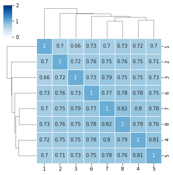
see this reference for colormap
[9]:
sns.clustermap(df,annot=True,cmap="Blues",vmin=0,vmax=2,linewidth=1,figsize=(5,5))
[9]:
<seaborn.matrix.ClusterGrid at 0x2aaab53b2d90>
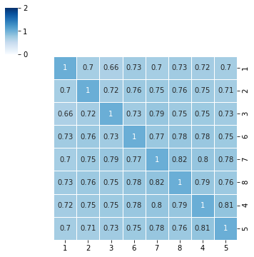
we can also remove dendrogram
[10]:
myPlot = sns.clustermap(df,annot=True,cmap="Blues",vmin=0,vmax=2,linewidth=1,figsize=(5,5))
myPlot.ax_row_dendrogram.set_visible(False)
myPlot.ax_col_dendrogram.set_visible(False)
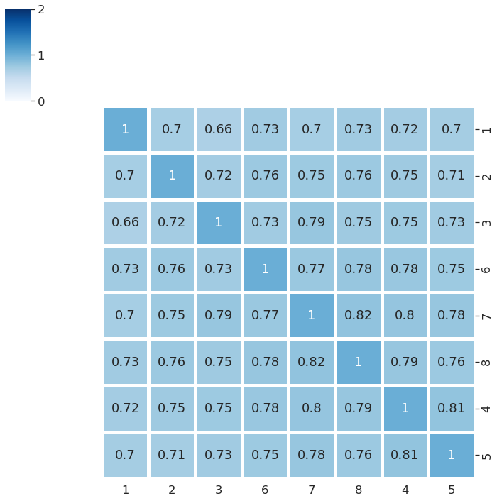
Make font size larger
[11]:
sns.set(font_scale=1.5)
myPlot = sns.clustermap(df,annot=True,cmap="Blues",vmin=0,vmax=2,linewidth=5,figsize=(10,10))
myPlot.ax_row_dendrogram.set_visible(False)
myPlot.ax_col_dendrogram.set_visible(False)
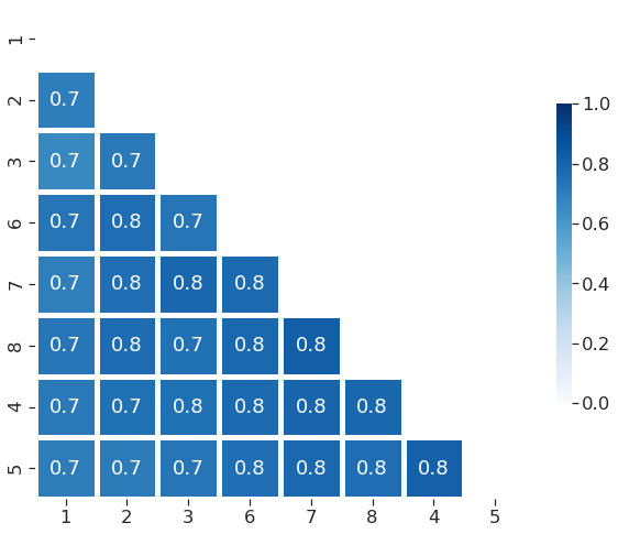
plot just half of the matrix
[12]:
sns.set(font_scale=1.5)
sns.set_style("ticks", {"xtick.major.size": 8, "ytick.major.size": 8})

def extract_clustered_table(res, data):
    """
    input
    =====
    res:     <sns.matrix.ClusterGrid>  the clustermap object
    data:    <pd.DataFrame>            input table

    output
    ======
    returns: <pd.DataFrame>            reordered input table
    """

    # if sns.clustermap is run with row_cluster=False:
    if res.dendrogram_row is None:
        print("Apparently, rows were not clustered.")
        return -1

    if res.dendrogram_col is not None:
        # reordering index and columns
        new_cols = data.columns[res.dendrogram_col.reordered_ind]
        new_ind = data.index[res.dendrogram_row.reordered_ind]

        return data.loc[new_ind, new_cols]

    else:
        # reordering the index
        new_ind = data.index[res.dendrogram_row.reordered_ind]

        return data.loc[new_ind,:]
df2 = extract_clustered_table(myPlot, df)
mask_df = np.triu(np.ones_like(df2, dtype=bool))
plt.figure(figsize=(10,10))
sns.heatmap(df2,annot=True,cmap="Blues",vmin=0,vmax=1,linewidth=5,fmt=".1f",mask=mask_df,square=True, cbar_kws={"shrink": .5})
[12]:
<AxesSubplot:>