Plot bw file correlation
usage: plot_bw_corr.py [-h] [-j JID] [-f BW_FILES] [-b BIN_SIZE]
                       [--bed_file BED_FILE] [-r REGION] [-o OUTPUT]
                       [--addon_parameter ADDON_PARAMETER]

plot correlation for all bw files in the current dir

optional arguments:
  -h, --help            show this help message and exit
  -j JID, --jid JID     enter a job ID, which is used to make a new directory.
                        Every output will be moved into this folder. (default:
                        plot_bw_corr_yli11_2021-08-02)
  -f BW_FILES, --bw_files BW_FILES
                        input file or use all bw files in the current dir
                        (default: None)
  -b BIN_SIZE, --bin_size BIN_SIZE
  --bed_file BED_FILE
  -r REGION, --region REGION
                        Could be chr11:5267561-5277281, HBG region (default:
                        None)
  -o OUTPUT, --output OUTPUT
  --addon_parameter ADDON_PARAMETER
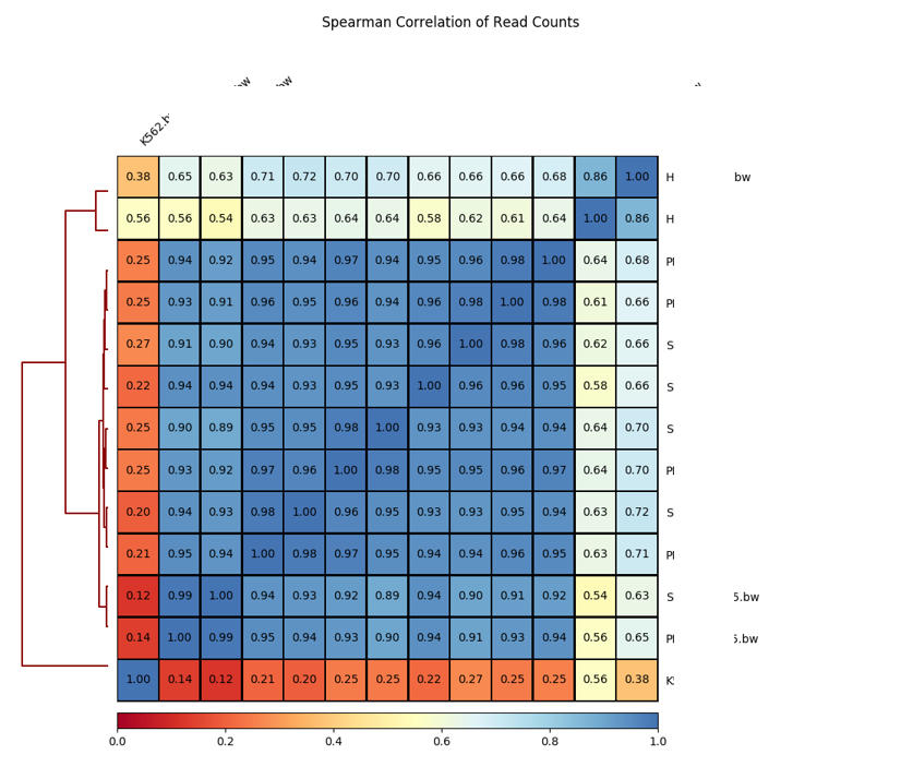
Summary
Plot spearman correlation given all bw files in the current dir. By default, bin size is 10kb.
Updates: Now user can provide a peak file to calculate correlation.
Input
Copy the bw files to your working dir, if you have a peak file, you can also copy it here. If you have multiple peak files, merge the first (How to merge? see: Merge_bed) and then copy the merged bed file here.
No specific input files are needed because all bw files in the current dir will be automatically used.
You can definitely control the input files using -f option. Files have to be quoted and separated by space, i.e., "file1.bw file2.bw file3.bw"
Output
In these plots, blue color indicates density.
Usage
Go to your data directory and type the following.
Step 0: Load python version 2.7.13.
hpcf_interactive

module load python/2.7.13
Step 1: Run the program
plot_bw_corr.py

2019-10-18 14:40:49,646 - INFO - main - The job id is: plot_bw_corr_yli11_2019-10-18
2019-10-18 14:40:49,763 - INFO - submit_pipeline_jobs - cor has been submitted; JobID: 88117190
Note
You can also control the bin size and a specific region to use when calculating correlations. See the example below.
plot_bw_corr.py -b 150 -r chr11:5267561-5277281
Usage: user input bed file
The following code uses all bw files in the current dir and a user-input bed file to calculate correlatin. Output is [output_label]_spearman_bed.pdf and [output_label]_pearson_bed.pdf
plot_bw_corr.py --bed_file input.bed
Re-order labels
Once the program is finish and you are not satistified with the order of columns and rows, you can re-order the figure using the following commands.
Input is the plotCorrelation.tab in your result folder.
Details are also provided in: plot_corr_reorder
Example — compare your ATAC-seq to public blood lineage ATAC-seq
Save the bw file list in blood_data as input.list.
hpcf_interactive

module load python/2.7.13

for i in `cat input.list`;do ln -s $i;done

## ln -s your own bw files here

plot_bw_corr.py
Why the low-values looks wider than the high-values in the scatter plot?
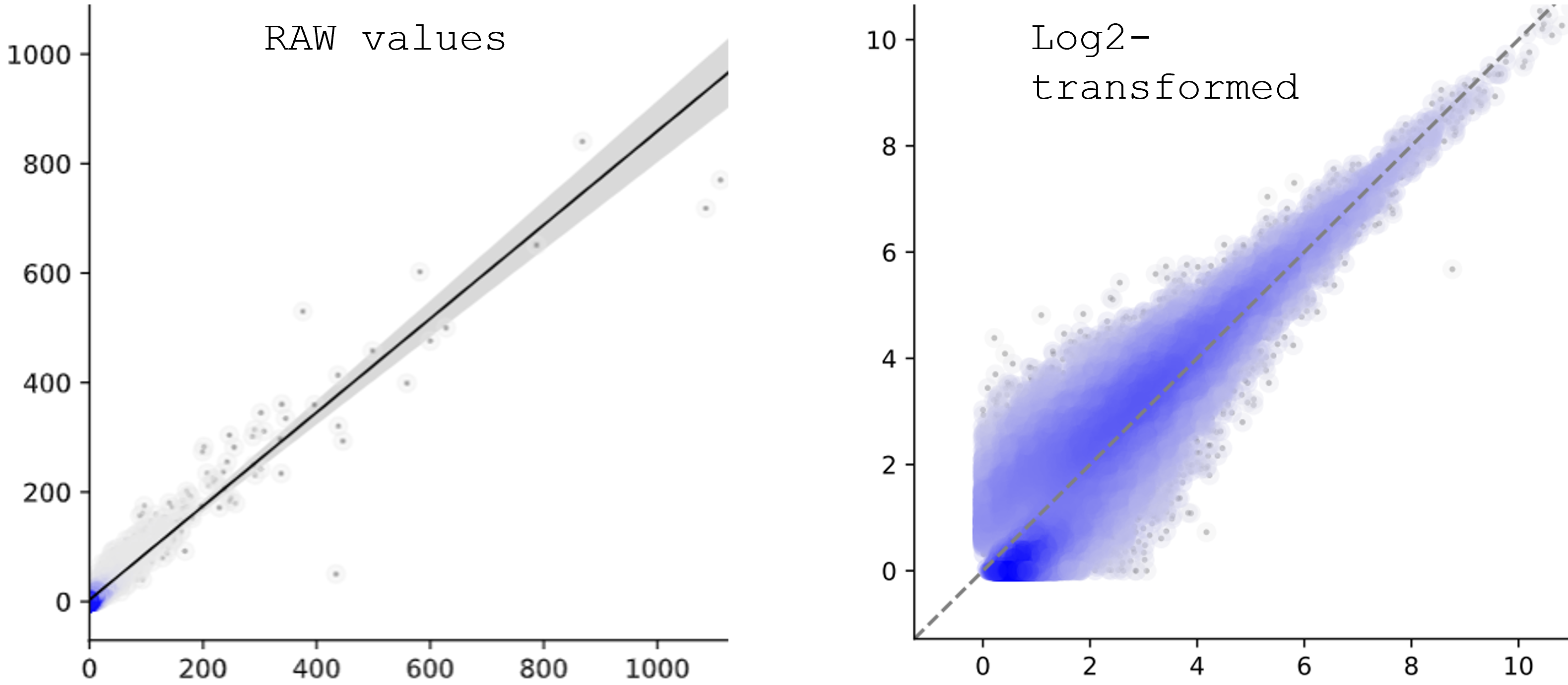
There are several reasons:
usually low-expressed genes tend to have more variance.
scale is different. most dots are squezed in a small area, maybe 0-200, but the range is 0-1400 (left figure), makes it look like quite the same between the two conditions (X and Y). On the other hand, log-transformed plot will have smaller range, which makes the variance visuable.
log-transformed is not linear. Differences in low-value will be larger and differences in high-value will be smaller. see: https://people.revoledu.com/kardi/tutorial/Regression/nonlinear/NonLinearTransformation.htm
Specifically for MA-plot or any other count-based scatter plots, log-transform of low-values, for example, 1-10, the output will look quite sparse on X-axis. On Y-axis, since it’s a ratio, it will still look like continous. Altogether, makes the MA-plot looks like https://mikelove.github.io/counts-model/model.html
log2 or log10 transformation?
Not likely to have visuable differences.