Overlapping Barplot
usage: plot_overlapping_barplot.py [-h] -f INPUT [-s SEP]
                                   [--skiprows SKIPROWS] [-o OUTPUT]

optional arguments:
  -h, --help            show this help message and exit
  -f INPUT, --input INPUT
                        correlation matrix with index and header (default:
                        None)
  -s SEP, --sep SEP     this program can infer separator automatically, but it
                        may fail. Use auto if the input tables contain
                        different separators. (default: auto)
  --skiprows SKIPROWS   Pandas read_csv parameter to skip first N rows
                        (default: 0)
  -o OUTPUT, --output OUTPUT
                        output file name (default:
                        yli11_2019-10-29_overlapping_barplot)
Summary
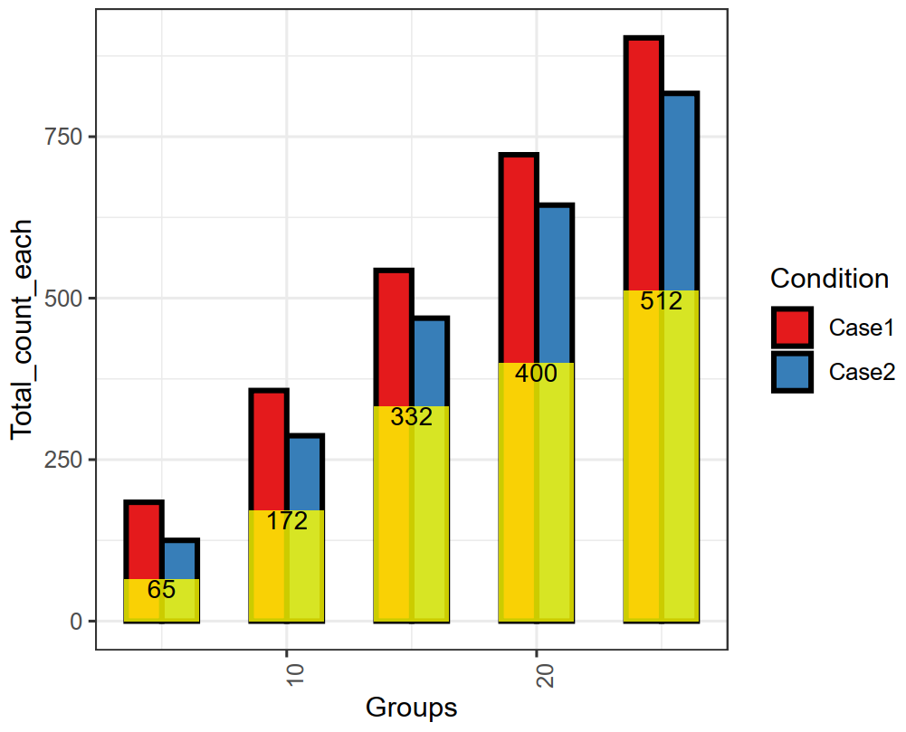
If you have many Venn Diagrams, this overlapping bar chart might be a good way to combine them into one figure. Note that this is only applicable to 2-set overlaps.
Y-axis is the total number of items in each set. X-axis is the groups, which can be banana, apple and oranges. Legend shows the two conditions in each group, for example, it can be western vs. eastern or A vs. B.
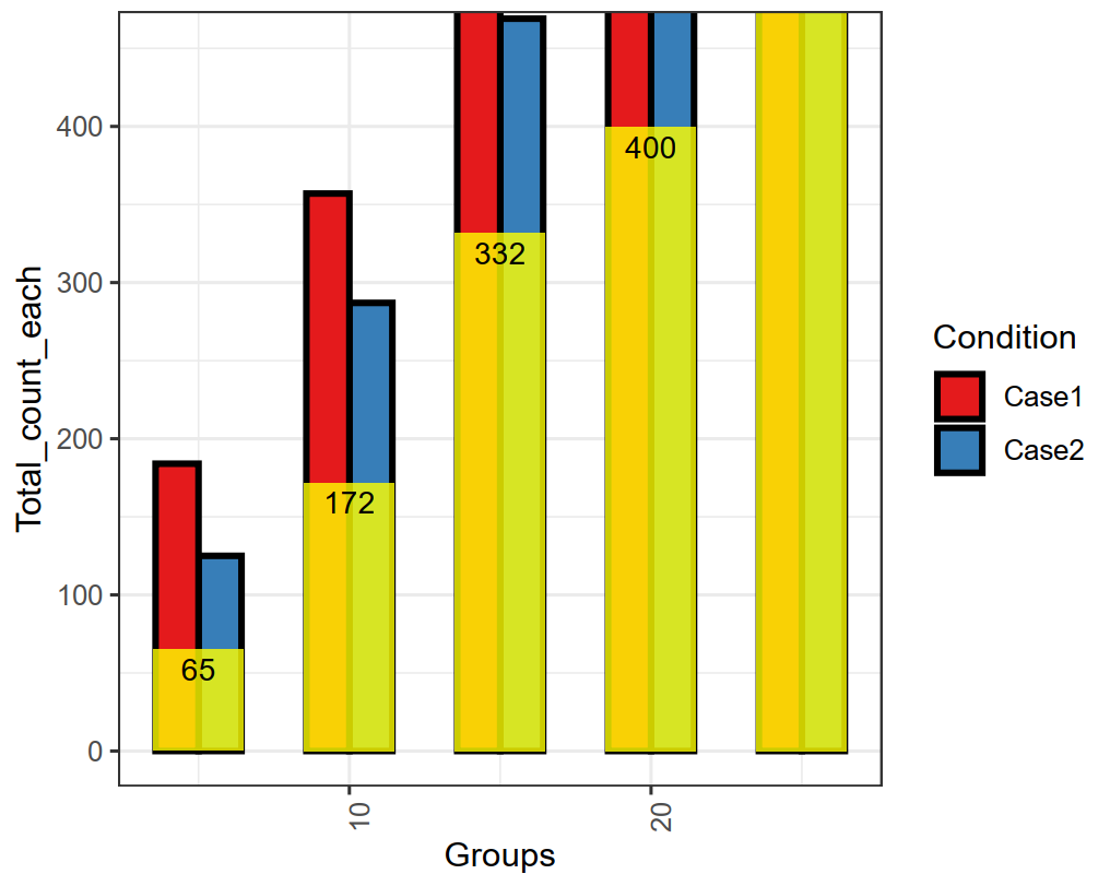
If the range is too big, it might be helpful to zoom in. Here, the Y-axis limit is set to half of the maximal count.
Input
The input format is very strict. Header should be exactly the same. Groups column is most likely to be strings, e.g., banana, orange, apple. Total_count_each is the number of items in each set. Conditions are the names of the two sets. Intersection is the amount of overlaps.
Groups  Total_count_each        Condition       Intersection
25      903     Case1   512
25      817     Case2   512
20      722     Case1   400
20      644     Case2   400
15      543     Case1   332
15      469     Case2   332
10      357     Case1   172
10      287     Case2   172
5       184     Case1   65
5       125     Case2   65
Usage
Go to your data directory and type the following.
hpcf_interactive

module load python/2.7.13

module load R/3.5.1

plot_overlapping_barplot.py -f input.csv
The two figures will be emailed to you shortly.