Plot correlation scatter plots
usage: scatter_density.py [-h] -f F [-s S] -x X -y Y [--index INDEX]
[--regression] [--diagnal_line] [--lowess]
[-bc BACKGROUND_DOTS_COLOR] [-hc HIGHLIGHT_COLOR]
[--highlight HIGHLIGHT] [-o OUTPUT]
optional arguments:
-h, --help show this help message and exit
-f F data table (default: None)
-s S sep (default: )
-x X column name for x axis (default: None)
-y Y column name for y axis (default: None)
--index INDEX index name for index (default: None)
--regression by default it is a dignal line (default: False)
--diagnal_line force to draw a dignal line (default: False)
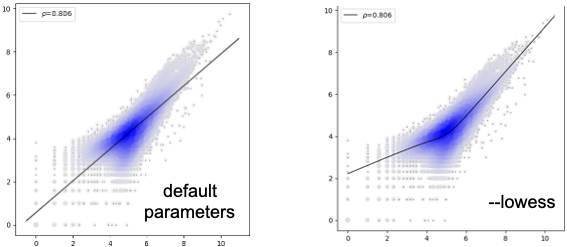
--lowess fit a curve (default: False)
-bc BACKGROUND_DOTS_COLOR, --background_dots_color BACKGROUND_DOTS_COLOR
background_dots_color (default: #0000ff)
-hc HIGHLIGHT_COLOR, --highlight_color HIGHLIGHT_COLOR
highlight_color (default: #ff1500)
--highlight HIGHLIGHT
column name for y axis, sep by comma (default: None)
-o OUTPUT, --output OUTPUT
output file name (default:
yli11_2020-09-22.correlation_scatter_density.png)
Summary
This script can be used to calculate sample correlation. Values are log-transformed, e.g., log2(x+1). Addtionally, you can also highlight some points, for example, to show some differences.
Input
Input can be tsv or csv. For tsv use -s "\t", for csv use -s ,
Geneid  Chr     Start   End     Strand  Length  Banana  Orange
asd1    chr1    3513707 3514076 +       370     800     22
b       chr1    3538168 3538438 +       271     24      16
a       chr1    3970540 3970785 +       246     16      6
b       chr1    4059120 4059436 +       317     44      12
a       chr1    4388977 4389294 +       318     22      11
b       chr1    4561768 4562101 +       334     31      11
a       chr1    4760133 4760340 +       208     23      9
b       chr1    5073062 5073299 +       238     36      20
The above example is a read count distribution for two chip-seq replicates.
The aim is to see the correlation between Banana and Orange, use -x Banana -y Orange to plot Banana column as the X-axis and Orange column as the Y-axis.
Usage
Sample correlation usage
hpcf_interactive -q standard -R "rusage[mem=10000]"

module load conda3

source activate /home/yli11/.conda/envs/py2/

    scatter_density.py -f input.tsv -s "\t" -x Banana -y Orange
Point highlight usage
hpcf_interactive -q standard -R "rusage[mem=10000]"
module load conda3
source activate /home/yli11/.conda/envs/py2/
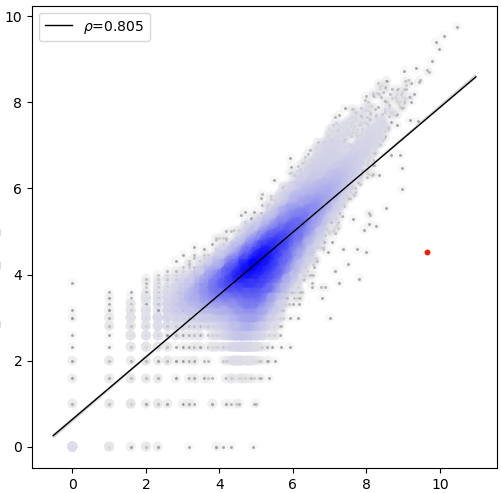
scatter_density.py -f input.tsv -s "\t" -x Banana -y Orange --index Geneid --highlight asd1 --regression
--regression is to add regression line. For sample correlation plot, regression line is on, for differential plot, the default is off.
If you have multiple points to highlight, use --highlight asd1,another_name,another_name2. These names should match the index name, which is defined using --index Geneid
Output
sample correlation
The value shown on the upper left corner is pearson correlation coefficicient.
differential analysis highlight
The value shown on the upper left corner is pearson correlation coefficicient.