Scatter plot by color, shape, and size
usage: scatter_plotly.py [-h] [--index] -f INPUT -x X -y Y [-s SEP]
                         [--xlabel XLABEL] [--ylabel YLABEL] [--title TITLE]
                         [--color_using COLOR_USING] [--size_using SIZE_USING]
                         [--shape_using SHAPE_USING] [-o OUTPUT] [--header]

Scatter plot given dataframe.

optional arguments:
  -h, --help            show this help message and exit
  --index               index is false (default: False)
  -f INPUT, --input INPUT
                        data table input (default: None)
  -x X                  X-axis (default: None)
  -y Y                  Y-axis (default: None)
  -s SEP, --sep SEP     separator (default: )
  --xlabel XLABEL
  --ylabel YLABEL
  --title TITLE
  --color_using COLOR_USING
                        input a file, index should be the same as the input
                        data frame (default: None)
  --size_using SIZE_USING
                        by size (default: None)
  --shape_using SHAPE_USING
                        by shape (default: None)
  -o OUTPUT, --output OUTPUT
                        output figure (html format) (default:
                        scatter_plotly_yli11_2021-02-17)
  --header              input table has header (default: False)
Summary
Given a dataframe, make a scatter plot.
Example
Input
Data table, tsv (default) or csv (-s ,). If data table contains both row names and column names, use --index --header
Usage
hpcf_interactive -q standard -R "rusage[mem=10000]"

module load conda3

source activate /home/yli11/.conda/envs/py2/


    scatter_plotly.py -x Color -y indel_rate --color_using Color --shape_using Shape --index --header -f plot_df.tsv --title crispresso2_indel_rate --xlabel sample_number --ylabel indel_rate -o countIndel_indel_rate.scatter_plotly
Note that --index --header specifies that the input data has column names and row names.
Output
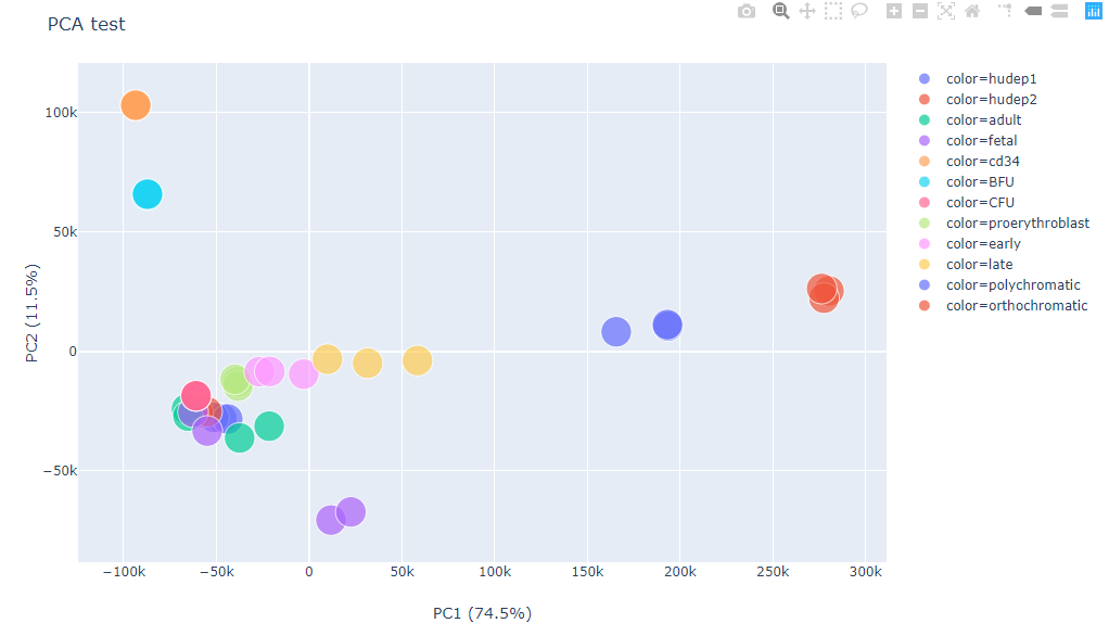
This is an interactive figure, please open the html file.
Comments
code @ github.